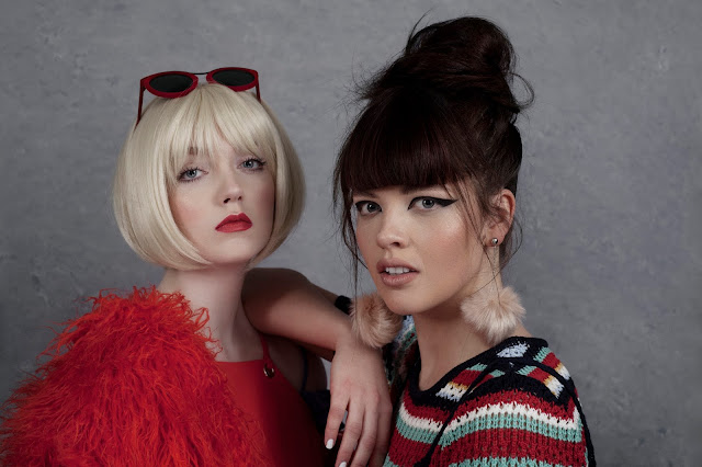
SUPERIOR GIRLS - BEHIND THE SCENES & LIGHTING SET UP
Saturday, April 23, 2016
Hey you.
So recently I had the absolute pleasure of working with these two amazing ladies from Superior Model Management; Rebecca and Amy J.
*click/tap images for high quality*
Not only are they're both insanely talented young women, they're genuinely lovely too. ♡ In fact, the entire team on this project were incredible.
Hair- Kimberly Logie
Make up- Stephanie Milne
Fashion styling- Kayleigh Swan
Photography & retouching- Rachael Sammon
Now I know I've been away for a while but I loved this shoot so much I thought I would show you a little look behind the scenes- and the lighting details if you're into that sort of thing! If you are, grab yourself a cup of tea and let's get going! If you're not, I'll see you in the next one.x
--
Alright, so, talking about it beforehand, we all decided that we wanted to shoot something quite slick and editorial. We pulled together our ideas and started building mood boards and each set about deciding what we would bring to the shoot.
I usually love to keep my light soft and natural looking so being the nerd that I am, I wanted to keep true to this but still have the light pop. Highlight-y, soft light, but with an editorial edge... Not that that's asking a lot of myself or anything!
Playing around with the lighting beforehand I decided on one of my favourite lighting set ups of the moment.
*click/tap images for high quality*
Does this make sense to you? I hope it does! This is how I find myself sketching out lighting diagrams, in a sort of aerial view, so hopefully you can see what I mean.
Shooting like this makes a nice big tunnel of light in front of the models, more than enough to illuminate the two perfectly, and it's feathered so you get that lovely glowing highlight. Of course I still wanted shadows and depth so that's where the black v flats come in. I genuinely don't know how I ever worked without them.
I also feel I should tell you that the white v flats were really, in this instance, two white walls. My living room, where I shot this, is teeny tiny so I just utilised the walls instead of cluttering up what little space there was.
bts image by Amy final image
If you're totally technically minded, you'll probably hate me for not knowing my settings off hand. If that wasn't bad enough, I hate to tell you that I also didn't meter the light; it's just how I liked the look of it on the day. I know, I know; prepare the gallows.
If you haven't clicked off in anger, here are the details (thank you Bridge)
--
--
Camera settings:
- f 6.3
- 1/125
- 100 ISO
Extra notes:
- Shooting in RAW, as always
- Canon 5D mk II
- Bowens 500 lighting kit set at around 2.5 power on each head
Why those settings? Well, for aperture I never shoot more than 6.3 because I'm a sucker for softness, but since we wanted that crisp editorial look 6.3 is, for me, a good balance of soft and sharp.
In terms of studio light, 1/125 is a good starting point for flash and anything not requiring a specific shutter speed. And, if you didn't know (which I didn't, even after three years of formal photographic education) you can't, in general, go higher than 1/250 with flash. That's when you get the black stuttering bars on your images because you're shooting too quickly for the bulb and you're out of sync- or something.
For ISO, 100 is really low for me; I love noise and grain. Since we were talking slick and clean I didn't want to go all out, but I couldn't help adding a little back in in post.
Back of the camera shot by Amy
final (slightly different) image
I had so much fun on this shoot- I think we all did!
Unedited / straight out of camera
--
Well, I think that's everything! It definitely was a long 'un, but I hope it was informative. If there's anything else you'd like to know, please don't hesitate to ask.
I'll leave you with the final images; I hope you love them as much as I do.
I'm in the midst of a wee portfolio refresh so if you could let me know your favourite(s), that would be amazing; I'd really appreciate it.
With love,
Rachael♡
*click/tap images for high quality*


0 comments